How to draw ambigrams
by Jonathan Gough, professional ambigram artist and graphic designer.
This is a how-to guide for learning the art of drawing ambigrams. Drawing ambigrams is a skill that can only really be learnt through practice and experience. If you want to try it, I suggest you jump right in and give it a go. This how-to should give you a few hints and tips along the way.This page contains information on how to draw ambigrams, followed by a walkthrough of a real design at the bottom of the page. You can go straight to the walkthrough if you don't really want to know how to draw them and just want to see how a design is worked through.
I find that there are three stages to drawing ambigrams:
- Choosing a word
- Curve fitting
- Fleshing out
Choosing a word
Names are a good choice for a starting word as they make excellent gifts for people. Try choosing a name between five and eight letters long as these are usually easier than longer or shorter names. You will find that some words work very easily, but others do not and just refuse to work as a design. If your words seems too difficult, try a different one and maybe come back to it on another day.Curve fitting
This stage involves working out how the ambigram will fit together, specifically which parts of letters will be used to form the other letters. Sometimes, this will be a one-to-one mapping (as in the walkthrough below), but in other cases several letters will be needed to form others. Take this example:In the ambigram above, notice how the 'Ja' forms the 'y', the 'm' forms the 'uc', and the 'es' forms the 'l'.
Getting a combination of curves that fits is very important. If you can't find any combination of curves that fits, try other combinations. Try using embellishments to form parts of letters that are missing, or try extending letters past their usual boundaries to see what happens. If the worst comes to the worst and you just can't do it, wait a day and try again. If not, try next week, or even next month before returning to it. Give it time and you'll be surprised what can happen.
When I draw ambigrams, I write the word down and then write it upside-down just above. This allows me to see what shapes I'm aiming for in the design process.
 If you want to be a serious ambigrammist, you must learn to understand what constitutes a letter. Look out for how different letters can be written (see right). With experience, you'll be surprised how easy it is to create the illusion of a letter when it's not actually there in a traditional sense. The fact is your brain wants to read a word rather than a collection of lines and it will force a set of curves into an word more easily than you think.
Fleshing out
This is where you actually convert the curves into something that looks like a proper font. A lot of people make the mistake of missing out this step, but this is the most important of them all and will give you many opportunities to increase the readability of your design.You need to choose a style and try to be as consistent as possible with that style. Don't worry if your designs don't look as good as professional designs at this stage - that will come with practice. If you really do want to improve in this area then you will have to study typography and letterforms, and be prepared to spend hours, even days just tweaking small bits. If you're not too fussed though then just have fun and see what happens. Try a slighly wacky style if you want because that will give you more leeway with how far you can contort the letters. Don't try to force an ambigram into a particular style, see what seems to come naturally. Setting off with a idea of a particular style to use is very tricky, and is not really reccommended.
There is simply not enough room to cover all facets of how to draw ambigrams here, but you will pick up many tricks along the way. The simple key is experimentation. I have a few 'trade secrets' and tricks that I use that are not listed here that help improve the readability of designs.
When designing ambigrams, there is a trap which is incredibly easy to fall into. As you know what your own design says, you'll be able to read it much more easily than other people. This gives the impression that the ambigram is more readible than it actually is. At this point, you may need to show the design to a friend who'll give comments. If the comments are along the lines of "I can't see what it says", then you may need to make some changes. I frequently show designs that I'm working on to friends and colleagues for input during this phase.
Walkthrough
I've already done stage one and decided to do an ambigram of my name: "Jonathan". Stage two involves fitting the curves to work out how the design will work. First of all, we'll write the name upside-down underneath it.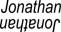
Now, we need to work out which letters look similar, or could be contorted to look like what we want. The first point is that the 'J' and 'n' are similar to the extent that they both curve round at the bottom:

Next letters, the a/o - this is trickier, as they don't look that similar. If we use a roughly circular letter 'a' though then it is quite similar:

The n/h - drawn in the correct way, an 'n' can be made to look like an 'h'. With practice, you'll remember combinations that work, like this one:

Next letters, the 'a' and 't' - I'm not entirely happy with this combination, but hopefully we can sort something out later. It'll do for now:

So now we are halfway, but we have J,o,n,a and t,h,a,n so we have actually finished. Luckily in this case we have a simple one-to-one mapping of letters, and we don't need to do anything fancy to get the ambigram to work. Let's put all of those together, and we get this image:

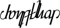
Hmm, not bad! Looks a bit funny still, and someone who didn't know it said 'Jonathan' might have difficulty reading it. Anyway, not to worry for now, that can always be corrected later. Onto the next step; fleshing out. Let's try converting those lines into something that looks like proper letters and not just an outline:

That looks okay for a first attempt, but the 'a' and 't' are awkward and stand out. Neither is the 'a' very clear. I'll try something else:
I extended the n/h to try to use a capital letter 'A', and this has come out perhaps as more readable. Difficult to tell though, and I'm still not happy. The J/n is looking a bit funny too, so maybe I'll extend the 'A' round and make it form a crossbar on the 'J'?
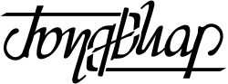
Yes, that looks quite good. Maybe I can improve the J further by actually adding one at the top? Whilst I'm at it, I don't like the way that the 'J' connects to the 'o'. I'll try adding a bit of artistic license by making it curve around the 'J'. The 'n' also needs better definition, so I'll just curve the end round - this won't affect the 'J' too much, but will make the 'n' much better:
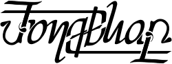
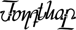
Looking good! Still not sure about the a/t combination though. Looks a little bit out of place. I'm also not keen on that line that runs through the middle now. Let's try experimenting:
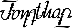
Eurgh, no that was horrible. Let's try again:
Better, but it looks a but messy and doesn't fit in with the style of the rest of the design. I'll try developing that a little by decreasing the length of the crossbar on the t and just tidying up the 'A' by making the line less apparent:
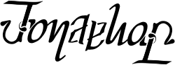
That's much better, and it's all in a consistent style. I'll develop the style a little bit by adding a few bits to the 'J' and 'h':
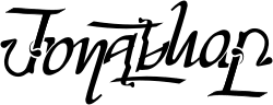
Nearly there... I'm not so keen on the italic though after all, so let's straighten it up and perform some minor tweaks:

And we have a finished ambigram! Just for display purposes, I'll decorate it a little bit, maybe add a texture and some other bits, and the result is as follows: http://ambigram.net/tutorial/

0 komentar:
Posting Komentar